
In the previous article, I shared about the reasons I use candlesticks chart for my analysis and trading. Since the devil is in the details, I will zoom in and bring you through the 2 most powerful and reliable candlestick patterns and strategies.
It is crucial to understand the concept of support and resistance before continuing.
#1 Head and shoulders
How does it look like?
As the name suggest, the chart pattern looks like a silhouette of a person’s head and shoulders.
Below: Chart of Facebook

How does it work?
The resistance zone is termed as “neckline” in this case. The neckline is a key technical feature as it validates the pattern.
Looking at the chart of Facebook (FB), you will see that there are two shoulders which surround the head. On the left shoulder, there is momentum to the existing up trend. Momentum fades towards the end, causing price to fall.
Buyers re-enter, and the price of the stock increases again, forming the left side of the head. Momentum dissipates and the head is completed.
Again, buyers step in, sending the stock price up, forming the left part of the right shoulder. Due to the inability to keep the momentum going, the price falls and the right side of the shoulder is formed.
If you see this pattern occurring at the peak of a bull market, it is a sign of a turn in the trend, at least temporarily (see the charts of Facebook, FB and McDonald’s, MCD).
The opposite is true for inverted head and shoulder patterns which will be elaborated after this.
Here are examples from Facebook (FB) and McDonald’s (MCD).
Notice the drop in price of Facebook’s shares after its neckline was broken?

A downward sloping neckline is found in the chart of McDonald’s. This is often a more bearish signal than a horizontal neckline. Prices crashed from $204 to $188 in a short 2 weeks.
How does the inverted head and shoulders pattern look like?
It looks directly opposite from the usual head and shoulders pattern (see the chart below of Exxon Mobil, XOM).
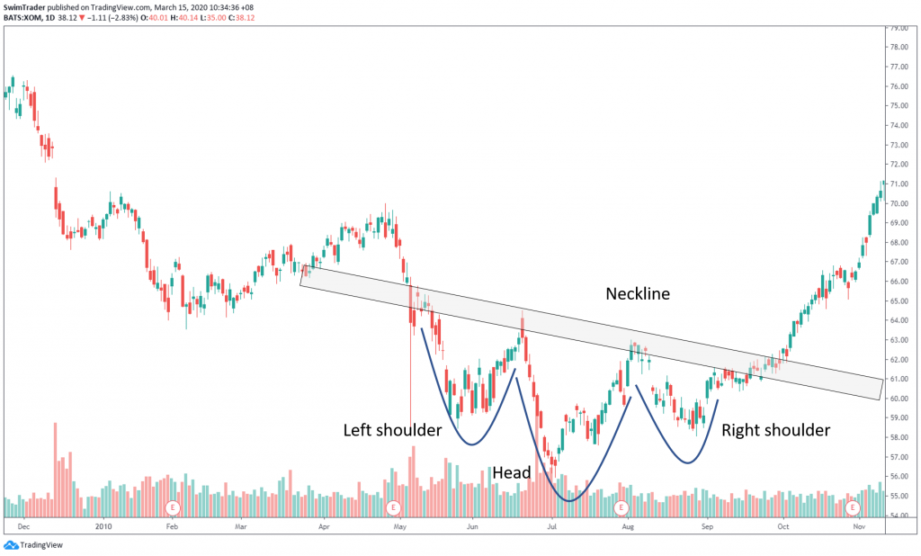
How does it work?
On the left shoulder, there is momentum to the existing down trend. Momentum fades towards the end, causing price to rise.
Sellers re-enter, and the price of the stock declines again, forming the left side of the head. Momentum dissipates and the head is completed.
Again, sellers step in, sending the stock price down, forming the left part of the right shoulder. Due to the inability to keep the momentum going, the price rises and the right side of the shoulder is formed.
If you see the inverted head and shoulders pattern occurring at the bottom of a bear market, then a turn in the trend may take place, at least temporarily (see the chart below of Exxon Mobil, XOM).
Again, a downward sloping neckline is present. This is a bullish sign, however.
Which strategy should I use?
Breakout strategy.
For the head and shoulders pattern, you can short sell once the price has broken through the neckline. Set your stop loss level to be slightly above the neckline.
You can go long when the stock shows an inverted head and shoulders pattern and its price has broken through its neckline.
Set your stop loss level to be slightly below the neckline.
#2 Triangle and flag
Please note that for simplicity purposes, I have grouped pennants and flags as one – flags.
Wedges and triangles are also grouped as one – triangles.
How does a triangle pattern look like?
A triangle chart pattern looks like a triangle. Examples of triangle patterns can be seen in the chart of Ball Corp (BLL) and Marriott International (MAR).
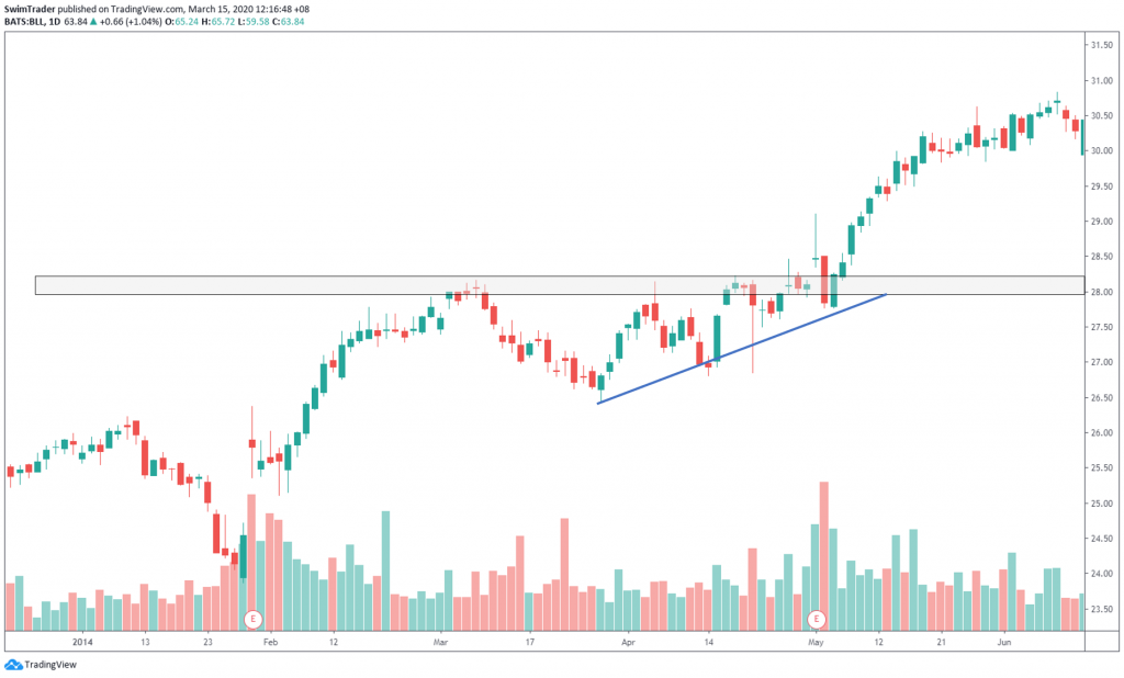
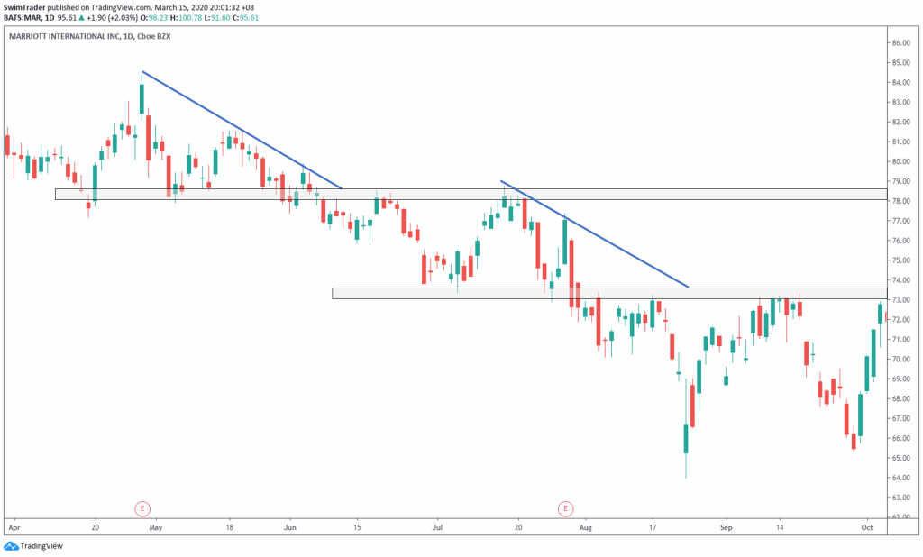
How does it work?
When you see a triangle in the midst of being formed, you will notice increasing momentum. This is shown in the higher highs for bullish times, while lower lows for bearish moments.
In a bullish market, there is a high chance that prices will break above the support zone as shown in the chart of Ball Corporation (BLL).
In a bearish market, there is a high chance that prices will break below the resistance zone as displayed in the chart of Marriott International (MAR).
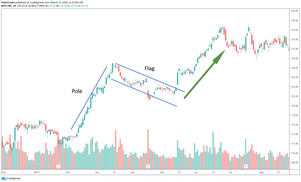
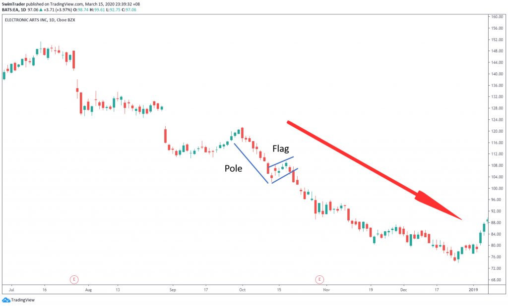
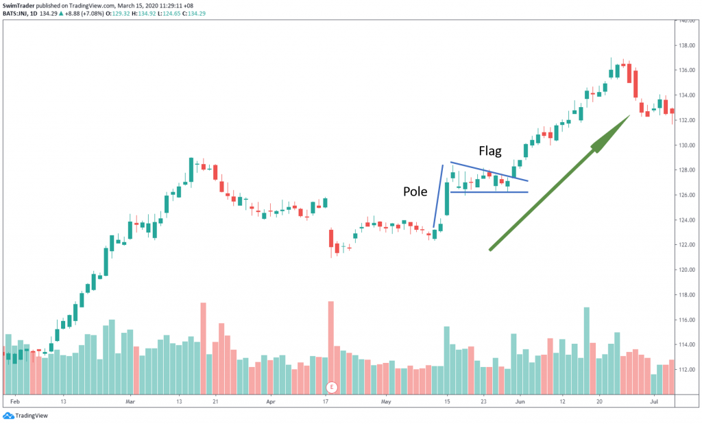
How does a flag pattern look like?
A flag pattern is one with a long and steep pole with a small pullback or consolidation as shown in the charts of Johnson & Johnson (JNJ) and Electronic Arts (EA).
How does it work?
There is a burst in price which indicates strong momentum. As with sprinting, there is a limit to the sustained burst. A short rest is needed before the next sprint (burst of momentum).
The burst in price is reflected in the “pole” while the “flag” shows the time of rest where prices consolidate or pullback.
Prices are more certain to continue trending in the direction of the pole, as shown in the chart of Johnson & Johnson, JNJ (below).
Which strategy should I use?
Breakout strategy.
For triangles, enter a long position after prices have broken through the resistance zone; enter a short position when prices have broken through the support zone.
For flags, enter a position in the direction of the pole after prices have broken out of the flag.
Conclusion
Both chart patterns are proven to be big and reliable. Triangle and flag patterns tend to occur more frequently, so learn how to identify them well and use them to devastating effect in this market condition!
Come back next week to learn how many shares you should buy or sell at any given time.
Here’s What You Can Do To Improve Your Trading Right Now:
#1 Join us in our Facebook Group and share your questions as we learn and grow.
#2 Never miss another market update; get it delivered to you via Telegram.
#3 Grab a front row seat and discover how you can expand your trading arsenal in our FREE courses (for a limited time only).
See you around!
