
How did you find Part 1? What did you learn?
Before moving on to Part 2, let’s do a quick recap on the critical lessons in Part 1.
In Part 1, you’ve been introduced to swing trading. You’ve assessed and found yourself to be suitable for swing trading.
You’ve done a comparison on the various brokers based on the critical criteria elaborated in Part 1. You’ve gone on to open a trading account and gotten familiar with its platform.
You’ve also selected a charting platform to do your homework.
Fundamental analysis doesn’t have to be boring and tedious. Since you’ll be looking to profit from an upswing/downswing (from a bull/bear market respectively), there is absolutely no need to run through the financial statements of companies. In addition, fundamentals take a long time to change, barring any shocks.
So if you haven’t read Part 1, click here to read it before proceeding.
Now, you’re ready to dive in to learn about technical analysis, the tools you need, reading the psychology of the market participants, strategies, and the mindset of successful traders.
Technical Analysis And The Tools You’ll Need For Swing Trading
You may recall that I rely mainly on technical analysis for my trades. You’ll soon learn of the reasons in this section and the subsequent ones.
What is technical analysis? Technical analysis is the study of price trends of any instrument. This means that technical analysis can be applied to cryptocurrencies, currencies, ETFs, indices, stocks, and more.
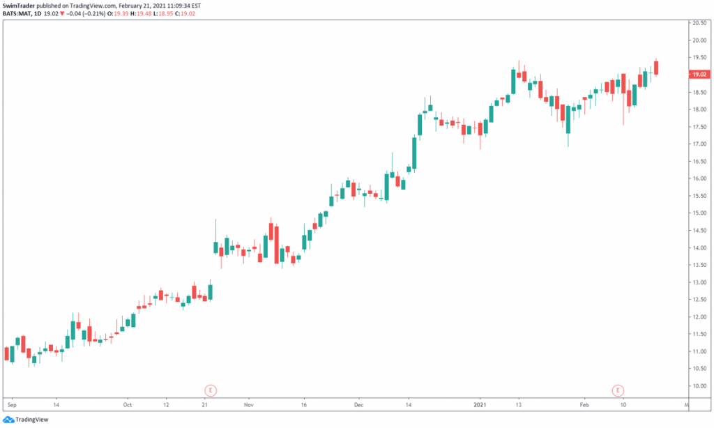
Technicians (the practitioners of technical analysis) believe that all available information has been factored into the price of any instrument. What better way to display prices than using charts? Therefore, technicians pay a lot of attention to charts such as the one below.
What can you tell from charts?
#1 Direction Of Prices
#2 Demand & Supply
#3 Key Levels & Turning Points
#4 Market Sentiment
#5 Volatility
Here’s an elaboration.
#1 Direction Of Prices
Charts are visual. At one glance, you’ll be able to tell if the price of an instrument is trending higher, lower, or stuck within a fixed range.
The trend of some stocks can be tricky to tell, so feel free to add in an indicator to assist you.
Tool You’ll Need
The most common and simplest indicator is the Moving Average (MA). Here’s how a MA looks like on the chart of LYFT.
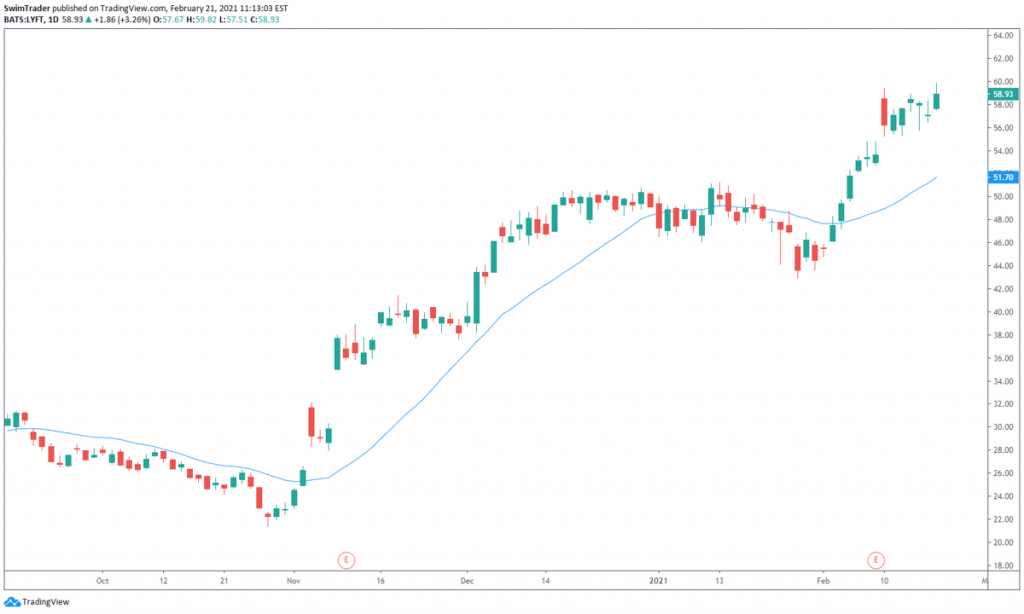
You can customize the time period of the MA. The most common time periods are 20, 50, and 200. Since swing trades usually last for days to weeks, a MA with the time period between 10 and 50 is ideal. I’ve used the 20 period MA for the chart above.
There are 2 main types of MAs too:
i) Simple Moving Average (SMA)
ii) Exponential Moving Average (EMA)
I won’t bore you with the different calculations here. You can read all about the calculations here.
The main difference is that the EMA is more responsive to changes in recent price movements than SMA is.
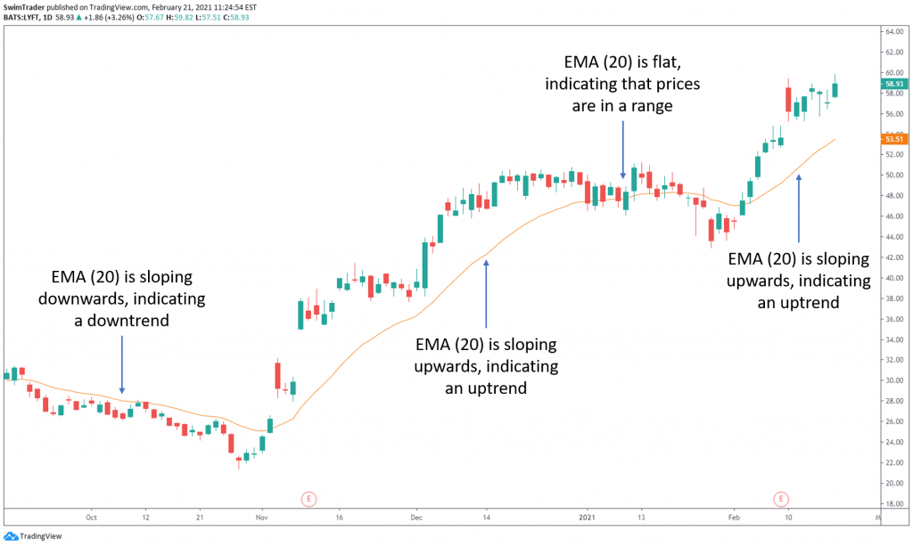
If the MA you have selected is sloping upwards, prices are heading up. If the MA is flat or moving up and down, prices are ranging. Confused, don’t worry. The chart of LYFT with a 20 period SMA (in blue) below will help you.

Let’s have a look at the same chart of LYFT, but with a 20 period EMA (in orange) instead.
Can you tell that EMA is slightly more responsive that the SMA of the same period?
#2 Demand & Supply
There are a couple of easy ways to infer demand and supply of any instrument – volume, and support and resistance.
The best part? They are free!
Tools You’ll Need
i) Volume indicator
All good charting platforms have this indicator. There are several display settings which you can customize, of which I prefer “Columns”.
For stocks, each column of volume tells you the number of shares traded in that period of time. You’ll want to buy instruments which have high volume as this translates into high demand and supply.
Besides, instruments with high volume translates into liquidity. You’ll be able to sell your holding easily.

Now, look at the volume indicator which you have added to your chart again. What do you notice?
Did you notice that volume varies from day to day? There’re periods of high, low, increasing, and decreasing volume. Click here to learn of the 2 powerful applications of the volume indicator.
ii) Support & resistance
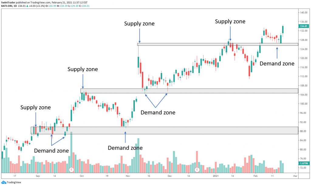
You may have heard of support and resistance. You may even have mapped out support and resistance zones on your charts. But hey, do you know why this is such an important free tool in technical analysis?
Support is an area where prices find a floor, unable to break below it. Resistance is an area where prices find a ceiling, unable to break above it. A picture paints a thousand words, so let’s take a look at the chart below to illustrate this.
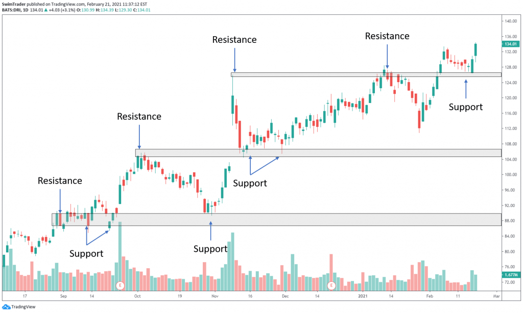
The reason why prices are unable to break below the support zone is because market participants find the price of that particular instrument to be cheap and acceptable. They’d purchase. As demand for the instrument at that price range intensifies, prices rise. What does this mean?
Support zones are demand zones.
The reason why prices are unable to break above the resistance zone is because market participants find the price of that particular instrument to be expensive. For those who had bought earlier, they are inclined to sell to realize their profit. As more market participants start selling, the supply increases. This causes prices to drop as selling intensifies. What does this mean?
Resistance zones are supply zones.
As the duration of a swing trade lasts for days to a couple of weeks, look at the past 3 years of charting data to plot your support and resistance zones.
You’ve learnt that support and resistance zones are zones of demand and supply respectively. The significance – prices tend to respect those levels and turn. This brings me to the next thing that technical analysis can shed light onto.
#3 Key Levels & Turning Points
There are several free tools to help you identify key levels and potential turning points on any chart.
You’ll want to know in advance where these key levels and turning points are to help you plan your trade and set the right expectation. Planning your trade includes shortlisting candidates to execute swing trading, calculation of the number of shares, contracts, units (for shares, commodities and currencies, ETFs and indices respectively).
Which tools do you need to spot key price levels and turning points in advance? How can you do this?
Tools You’ll Need
i) Support & resistance
The use of support and resistance has been covered in the previous section, so I’ll skip repeating myself here.
ii) Trendlines
Trendlines are sloping lines which you can easily plot on your charts.
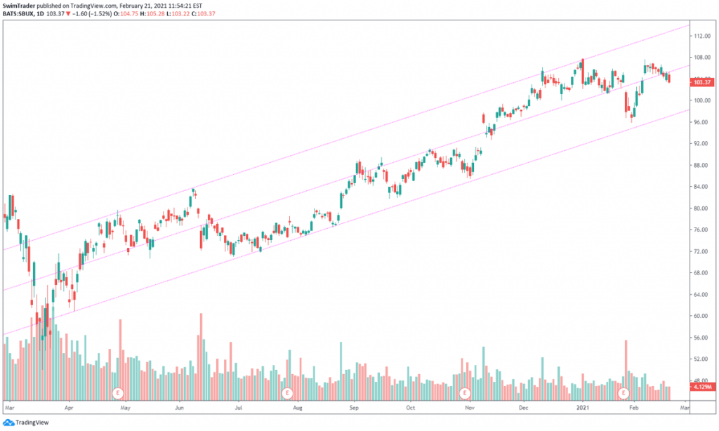
As the duration of a swing trade lasts for days to a couple of weeks, you’ll just need to zoom out to start plotting your trendlines from the low of the latest crash (in Mar 2020) or the previous crash (in early 2019), whichever is lower.
How can you ensure that your trendlines are accurate and significant? Prices should touch your trendlines and bounce off at least 3 times.

Besides telling you of the potential turning points ahead, trendlines are able to tell you of the following too:
a) Diagonal support & resistance
Diagonal support and resistance? Remember the trait of an accurate and significant trendline? Prices should touch and bounce off your trendlines at least 3 times.
This is what support and resistance zones do too! Prices get stopped or bounce off their support and resistance zones.
b) Speed of ascent/descent

You can also the speed of the trend of any particular instrument by drawing trendlines. The speed of any trending instrument can be inferred from the gradient of your trendlines.
Interested in knowing more about trendlines? I’ve written an article on trendlines recently and you can read it here.
Practice makes perfect, so have a go at plotting trendlines!
If you are unsure whether the trendlines you have drawn are accurate, share your chart with us on our Facebook Group by clicking here and we will guide you. Share your findings on our Facebook Group too!
iii) Pivot Points
Pivot Points is a less known indicator. However, it is widely used by professional traders.
The Pivot Points indicator is based on a mathematical formula which can be found here.
The idea behind this indicator is to buy at the instrument’s pivot point and sell at its 1st resistance level (which is termed R1) in an uptrend. If the trend is strong and shows no sign of slowing down, buy it again at its 1st resistance level and sell it at its 2nd resistance level (termed R2).
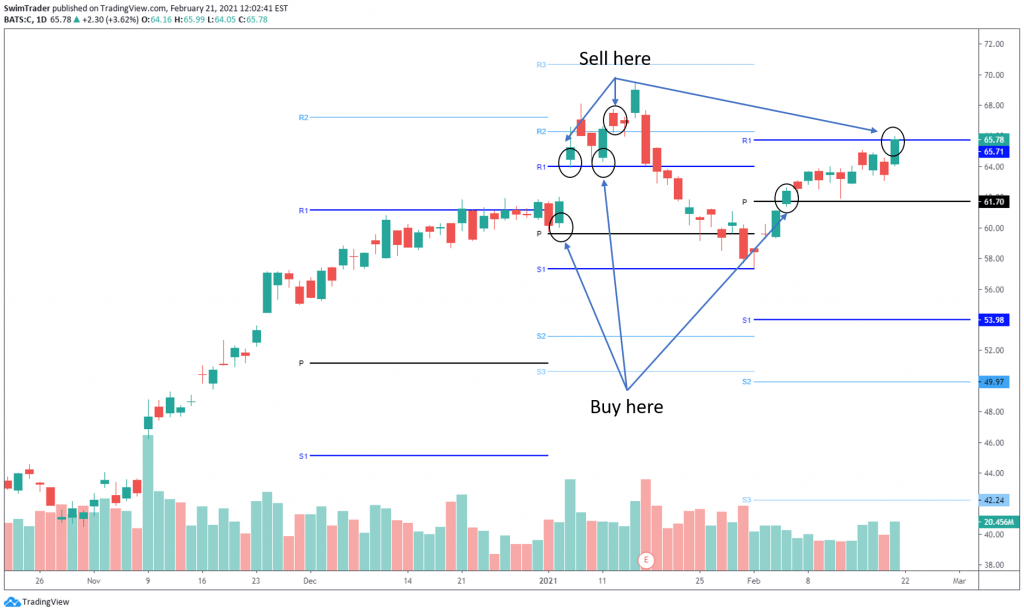
The Pivot Points indicator should be of a higher timeframe than the timeframe you use for your charts. If you trade based on the daily chart, you should be using the monthly timeframe for the Pivot Points indicator.
iv) Relative Strength Index (RSI)
The RSI indicator is a dynamic and powerful indicator (below the Volume indicator). It can warn you of an impeding turning point.
There are 2 main levels that the RSI indicator marks out – overbought (>70) and oversold (<30).
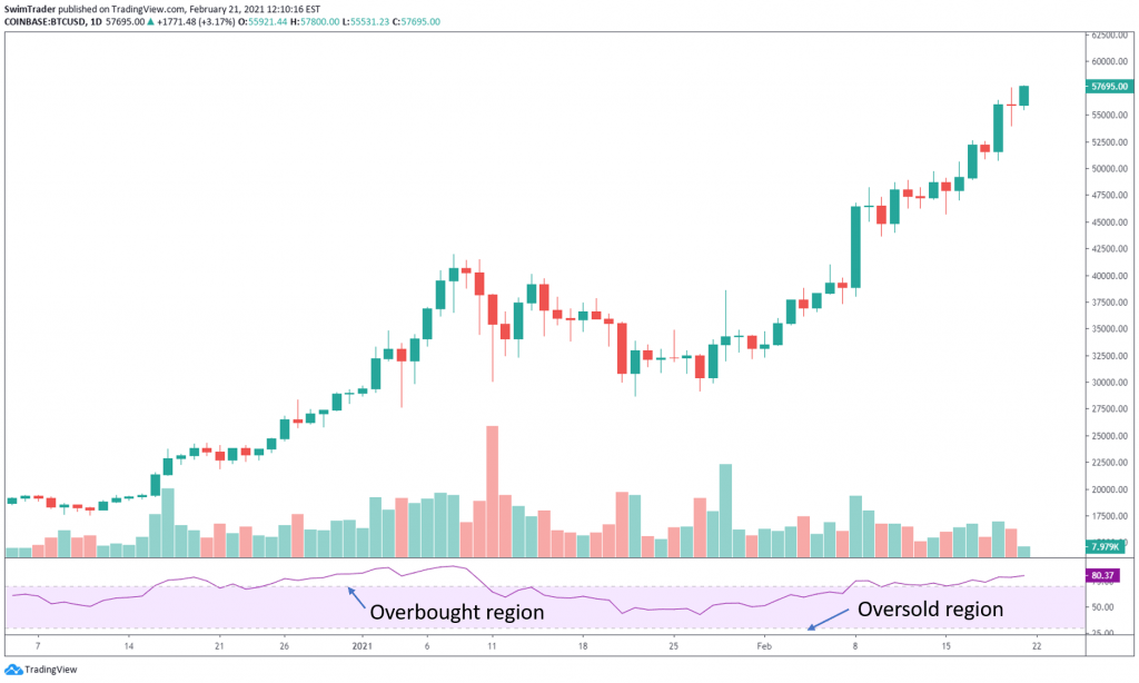
As the names of the 2 levels suggest, when the RSI reading is >70 (overbought), prices are highly inflated and should drop soon. When the RSI reading is <30 (oversold), prices have been sold to the bottom and should rise soon.
Hang on! Before you get too carried away and start buying stocks or other financial assets that are oversold (<30) or sell short those that are overbought (>70), please note that all financial assets can remain in the overbought or oversold region for some time before prices turn.
Predicting turning points is best done with a combination of 2 or more of these techniques mentioned above.
The RSI indicator is capable of much more than predicting turning points. To discover more applications of the RSI indicator, click here.
#4 Market Sentiment
Would you like to know if the market sentiment is bullish, bearish or meh? Reading the market sentiment will be helpful in timing your trades which reduces your exposure to market risks.
This can be done by using the 2 tools mentioned below.
Tools You’ll Need
i) Candlesticks
Why use candlesticks?

Candlesticks are rich in details which captures the market sentiment for that trading day and before. The use of candlesticks can also tell you the strength of the trend.
Before I share about how you can read the market sentiment using candlesticks, here’s how you can switch to viewing candlesticks on your chart.
If you are using Tradingview, you’ll see a bar at the top of your chart. Click on the icon that’s next to the timeframes and select “Candles”.

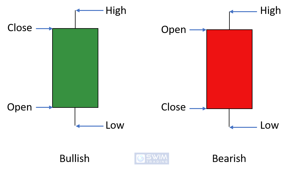
Now, did you notice that there are 2 colors of candlesticks – red and green? When a trading session closed higher than its opening price, the body and wicks of the candlestick are green.
When a trading session closed lower than its opening price, the body and wicks of the candlestick are red. Don’t you love how visual they are?
Did you also notice that the bodies of candlesticks differ? Some candlestick have green/red long bodies. Some have green/red short bodies. Some don’t seem to have a body at all. What’s the significance of the body length of candlesticks?
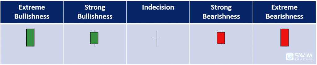
Ok, so the candlesticks that are in green are bullish and those in red are bearish. Those with a tiny body are indecision candlesticks where the market participants are either not interested or undecided. How does this apply to the real world of trading?
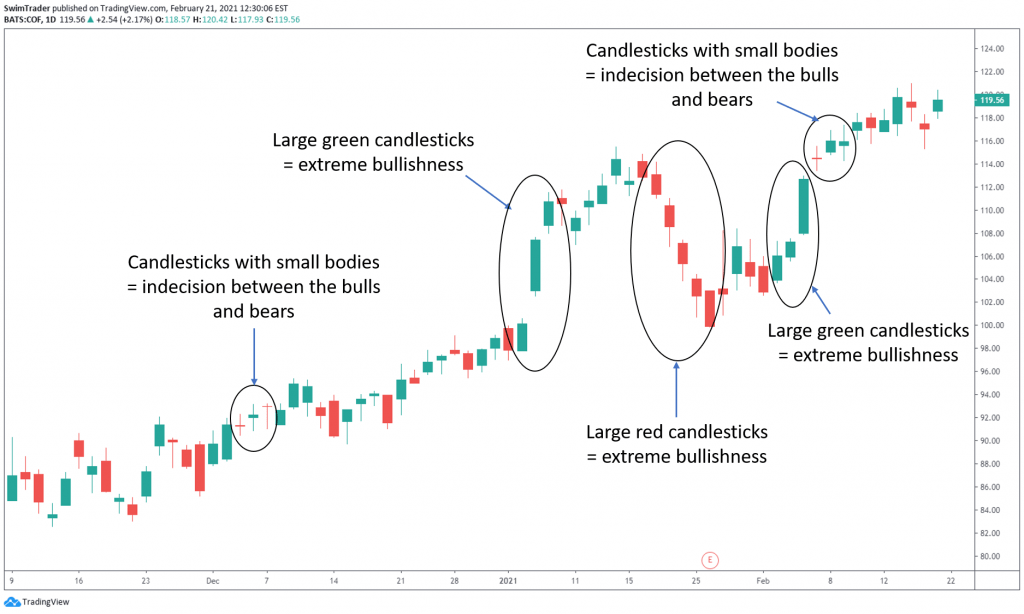
As you can see from the chart of COF above, there are small and huge candlesticks. When there are large green/red candlesticks, the move up/down is steep and swift.
When the green/red candlesticks are smaller, the move up/down is more gradual.
ii) Volume

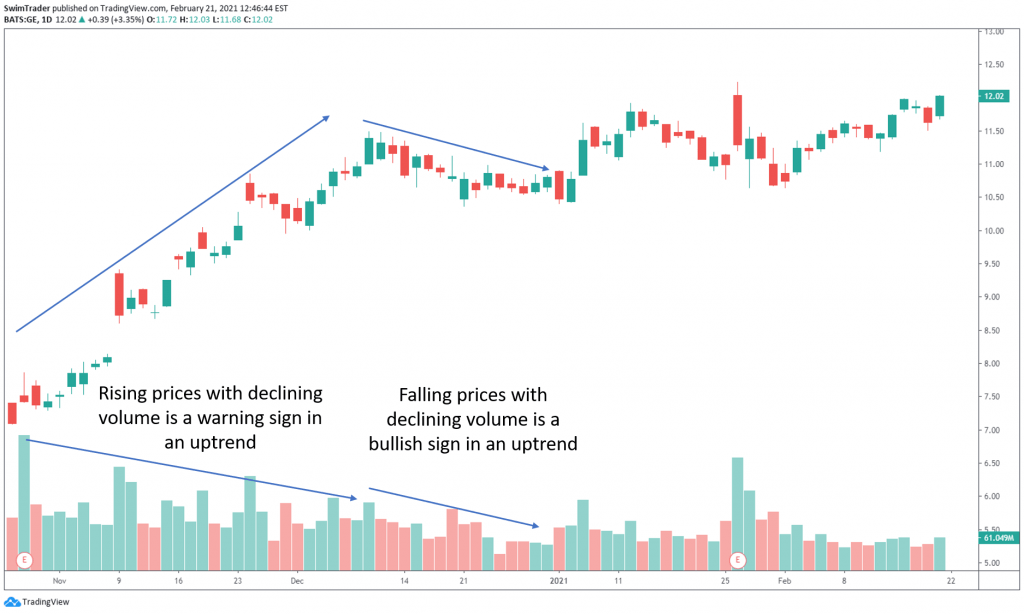
Can you recall that volume tells you the number of shares traded in that period of time? What does this mean in terms of market sentiment?
If there’s strong demand or supply, there’ll be high volume. This infers that the volume should be high when there is a trend (up and down). However, there’re moments where the price of an instrument is trending higher while the volume is low or descending. This is a red flag, signaling a change in market sentiment.
Why?
Imagine I come up with a new watch brand called Swim. It’s intricate, automatic, and made in Switzerland. It’s priced at $8,000. Will there be buyers? Maybe. It is highly likely that I’ll just have a few buyers.
One day, Drake was spotted wearing a Swim watch during an interview to promote his latest single. Other celebrities start wearing a Swim watch. All of a sudden, the world knows about Swim watches and wants it.
The price of a Swim watch rises tenfold to $88,000.
One year goes by and my watch isn’t worn by celebrities anymore. Can my watch still command $88,000? It is unlikely. Since demand and excitement have dropped, the price of a Swim watch should drop as well. It doesn’t make sense for it to hold its price tag of $88,000, especially for a new brand that’s up and against giants such as Rolex and Audemars Piguet.
As prices continue to climb/slide, demand/supply should be high, hence volume should be high. If volume decreases while prices climb/slide, market participants are losing interest to buy/sell. A stall of the existing trend or even a trend reversal is near.
Let’s have a look.
#5 Volatility
Depending on your risk appetite, you may not want to trade an instrument that’s volatile. Volatility is necessary as this means that prices are moving for you to have a chance at making money.
Do you remember the formula for position sizing?

A volatile stock widens your stop loss amount per share. This equates to the ability of buying fewer shares than those that are less volatile.
Are there tools to help you spot an increase or decrease in volatility?
Tools You’ll Need
i) Average True Range (ATR)
The application of the ATR indicator has been elaborated in Part 1. Revisit Part 1 to learn about it here.
ii) Bollinger Bands
iii) Donchian Channels
iV) Ketlner Channels
The Bollinger Bands, Donchian Channels, and Ketlner Channels indicators can tell if an instrument is volatile. Volatility can be seen from the width of the Bollinger Bands, Donchian Channels, and Ketlner Channels. The wider the bands or channels, the higher the volatility of an instrument.
I’ll not elaborate on the Bollinger Bands, Donchian Channels, and Ketlner Channels indicators here.
You can learn about the Bollinger Bands indicator by clicking here.
You can learn about the Donchian Channels by clicking here.
You can learn about the Ketlner Channels by clicking here.
2 Swing Trading Strategies & The Psychology Behind Them
You’ve finally reached the section on swing trading strategies! Give yourself a pat on the back!
In this section, you’ll learn of 2 common yet powerful swing trading strategies and the psychology behind them. What are the 2 swing trading strategies?
#1 Flag
#2 Pennant
#1 Flag
This chart pattern is the most common and can be found in most (if not, all) instruments. Please note that for the flag chart pattern to work brilliantly, prices of the instrument must already be trending.
The flag chart pattern consists of 2 parts – pole and flag, as noted on the charts below.
Here’s an example on the chart of S1! (Silver futures).
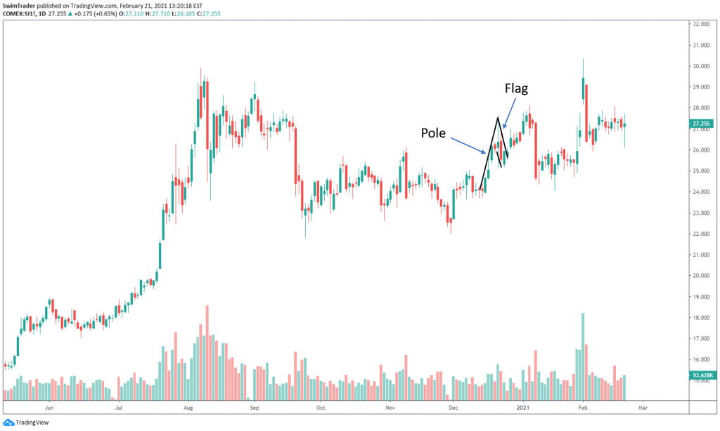
The pole is an upward/downward thrust (in an uptrend and downtrend respectively). A steep pole is preferred.
The flag is made up of 2 parallel lines which run horizontal or opposite to the direction of the pole.
Market Psychology
Volume must be high or increasing as the pole is being formed.
In an uptrend, market participants are super bullish. Demand is high as inferred from increasing or high volume. This results in a surge in prices. Therefore, there must be high or increasing volume as the pole is being formed.
Whatever that goes up must take a break or come down. Imagine sprinting 400m. Can you sprint another 400m immediately? Not unless you’re a seasoned runner.

This is the same with trading. Prices will need time to rest and recover before rising or surging again.
Therefore, there’ll be a short break from the rise. Prices will either stagnate or dip for a short while. As prices stall or decrease, there should be low or decreasing volume. Can you tell why?
When prices are decreasing with high or increasing volume, it means that the downtrend is likely to continue given that the supply is high. Falling prices with falling volume indicate that the selling is drying up, so the decline of prices is about to stop.
The direct opposite is true in a downtrend. Market participants are bearish. Supply is high and this can be inferred from low or decreasing volume. This causes a collapse in prices. Hence, there must be high or increasing volume as the pole is being formed.
After a while, there’ll be a short break from the decline in prices. Volume should be low or decreasing here as the sell off stalls.
Once the market participants are ready to enter the market again, demand/supply increases (in an uptrend and downtrend respectively), sending prices higher/lower. This is the moment you’ve been waiting for to buy/short-sell.
Swing Trading The Flag Pattern
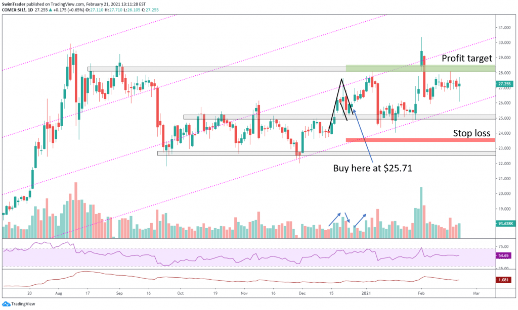
Silver is in an uptrend. A perfect flag chart pattern appeared in the middle of Dec 2020.
The pole was long and steep. Volume was increasing throughout the formation of the pole.
The flag ended at $25 which coincides with the support zone. Volume was also decreasing as the flag was formed.
Take a look at the ATR and multiply it by 2 to give you the stop loss amount per ounce of Silver. That’d be $1.96.
The entry would be at $25.71. To calculate where to place your stop loss at, subtract the stop loss amount from your entry price. That’d be $25.71 – $1.96 = $23.75.
Where should you place your profit target level at? It should be placed at the next resistance.
If these rules and steps are followed, you’d have made a tidy profit of $2.30 per ounce of Silver bought. That works out to 8.9% in 2 weeks!
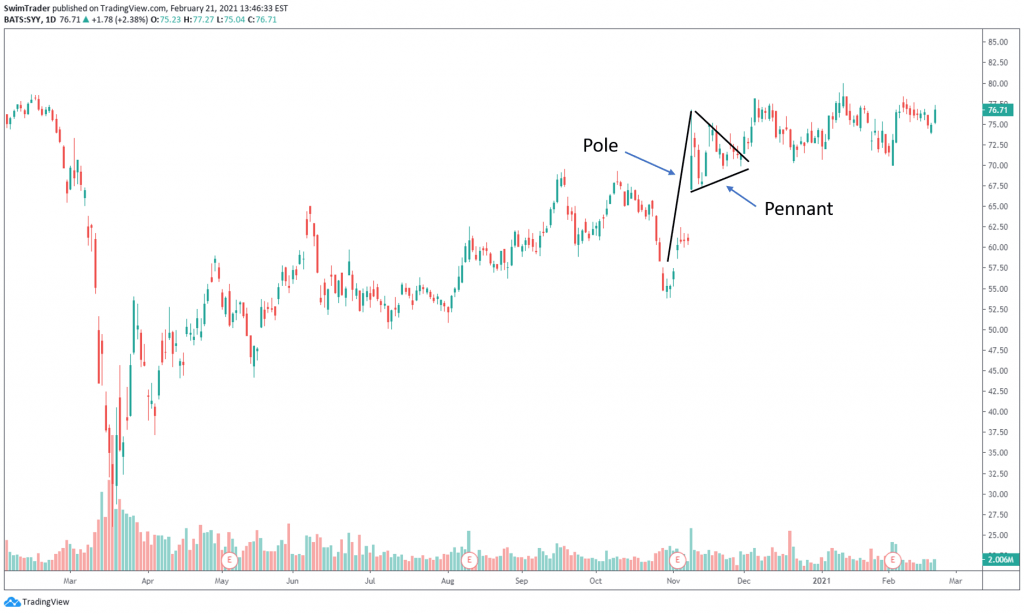
#2 Pennant
The pennant chart pattern is not as common, but the strategy and psychology behind it is the same as the flag chart pattern. Please note that for the pennant chart pattern to work according to plan, prices of the instrument must already be trending.
The pennant chart pattern is also made up of 2 parts – pole and pennant, as pointed out by the chart below.
Market Psychology
In a bullish market where prices are rising, you’ll want to see high or increasing volume on the up swings. You’ll want to see low or decreasing volume as prices pullback.
This is because the market sentiment is optimistic. Buyers are entering the market, driving up demand. There are more green and large candlesticks.
As we all know, all good things must come to an end, at least temporarily. Rising prices will have to take a break by ranging or declining a little. As prices stall or decrease, there should be low or decreasing volume.
The direct opposite is true in a bearish market. Sellers are in control, so there will be many red and large candlesticks. You’ll want to see high or increasing volume on the down swings to signal strong bearish momentum, and low or decreasing volume as prices pullback.
Swing Trading The Pennant Pattern

SYY is in an uptrend. A perfect pennant chart pattern appeared in Nov 2020.
The pole was long and very steep. Volume was increasing throughout the formation of the pole.
The pennant ended at $69 which coincides with the support zone. Volume was also decreasing as the flag was formed.
The ATR was $2.62 then. Multiply it by 2 to give you the stop loss amount per share of SYY. That’d be $5.24.
The entry would be at $71.30. To calculate where to place your stop loss at, subtract the stop loss amount from your entry price. That’d be $71.30 – $5.24 = $66.06.
Where should you place your profit target level at? It should be placed at the next resistance.
If these rules and steps are followed, you’d have made a tidy profit of $7.70 per share of SYY bought. That works out to 10.7% in just a week!
Combination Of Technical Analysis Drawings And Indicators

The above mentioned chart patterns appear all the time. For best results, pair them with trendlines, support and resistance, volume, RSI, and ATR indicators.
Why is this a good combination of indicators?
#1 Trendlines are diagonal support and resistance zones. They can also tell you the speed of ascent or descent, enabling you to maximize your money by picking the faster moving stock.
#2 Support and resistance are demand and supply zones. They tell you the areas where market participants are keen to buy or sell, causing prices to rise or fall.
#3 The Volume indicator tells you if the up or down move is legitimate. This helps you avoid being trapped in a fake move.
#4 The RSI indicator tells you if the instrument is in the overbought or oversold territory. This allows you to time your entries and exits better.
#5 The ATR indicator tells you if the volatility of the instrument and the price level to safely place your stop loss at.
Refer to the chart of Silver futures and SYY above as examples of combining technical analysis drawings and indicators to swing trading profitably.
The Mindset Of Successful Traders

Successful traders have gone through spells of losses. They have come to terms that having the right strategy doesn’t equate to winning all the time. There will still be spells of losses.
But they have mastered their trading mindset.
To master this mindset, you have to realize that the goal of trading (or swing trading for this matter) isn’t purely to make money.
The aim is to improve in taking your trades. Aim only for the good ones and let the rest go. Missed a good trade? It’s ok. Don’t chase it. Let it go.
The other aim is to become consistent in your decision making.
By working on your technique, strategies, and decision making, you’ll improve on your trading.
Successful traders plan well, are aware of one’s emotions (before, during, and after buying or short-selling), stick to their plan, and are disciplined in money management.
They spend time to analyze the market and forming a watchlist, plan how much to allocate to each instrument before applying position sizing, identify and choose the strategy they’d like to use, plotting their charts, checking their emotions to stay calm and focused, and lastly to stick to the main plan before considering if they need to activate their contingency plan if the trade doesn’t go as planned.
Doing all the above, they hardly feel stressed because of trading. They are able to experience life with their loved ones.
Practice these qualities of successful traders. Think of improving your focus, emotional calmness, strategies and techniques, and work on your decision making.
Things You Have Learnt

You’ve come to the end on the complete guide to learning swing trading. Here are the points that you must remember:
#1 Technical analysis can tell you the direction of prices, demand and supply zones, key levels and turning points, the sentiment of market participants, and volatility
#2 Inferring the strength of the trend through the size of the candlestick
#3 There are many different technical analysis tools and indicators to help you
#4 The uses of the different technical analysis tools and indicators
#5 Spotting the 2 chart patterns correctly and entering at the right time
#6 Set your stop loss at least 2x ATR below/above your entry in an up/down trend
#7 Combine the different technical analysis tools and indicators to get the ideal result
#8 Successful traders always seek to improve on their strategies, techniques, and decision making
Here’s What You Can Do To Improve Your Trading Right Now:
#1 Register for our market outlook webinars by clicking here
#2 Join us in our Facebook Group as we can discuss the various ways of applying this by clicking here
#3 Never miss another market update; get it delivered to you via Telegram by clicking here
#4 Grab a front row seat and discover how you can expand your trading arsenal in our FREE courses (for a limited time only) by clicking here
See you around!
